SCC FFL 2022: Sports Marketing Challenge #2 Recap & Scores
SCC FFL 2022: Sports Marketing Challenge #2 Recap & Scores
Two challenges in and the leaderboard is crowded at the top. Our new (“rookie”) school participants have performed extremely well so far, making for a very competitive field…nearly everyone is still in the mix for a run toward the top of the standings.
Points have been allocated for the second round of sports marketing challenges (branding) and the updated standings are available at the bottom of this post. We also wanted to highlight a few of the best (and most creative) responses submitted in this round.
Blacksburg High School, Virginia (Virginia Beach Tridents)

Blacksburg students impressed once again with a fantastic response to the branding challenge. From team colorways and logo to a season slogan and great uniform design, the Tridents’ front office seems to be in it to win it this year.
One of the things that really stood out was the emphasis the Tridents placed on the development of not only establishing the brand but also building the foundation for long-term brand loyalty. Prioritizing brand loyalty is paramount to any expansion franchise, and Blacksburg students knocked this one out of the park.
The Tridents front office created a number of great brand extensions, including the integration of fun game day traditions (the team mascot, King Neptune, diving into the stadium’s pool and raising a trident at the start of every game to get the crowd going), introduction of brand ambassadors like Pharrell Williams and Mark Ruffalo who represent the Virginia Beach community and featuring some “on-brand” concessions items like seafood at the stadium.
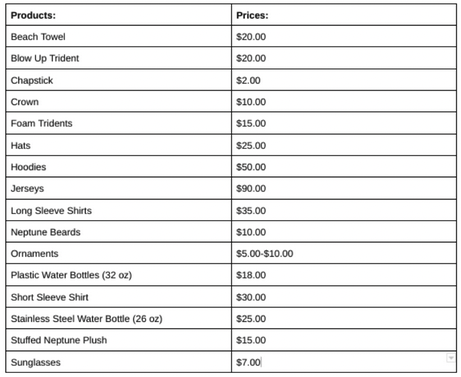
We also liked the detailed list of the wide variety of licensed merchandise available to Tridents fans. It is obvious that this group put a lot of time and energy into this challenge. Really well done BHS students!
Carl Sandburg, Illinois (Toronto Coyotes)
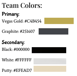
Great to see the attention to detail that went into the development of the Coyotes brand from Carl Sandburg HS students, right down to the colorways used to create the team’s colors. The Coyotes front office will use Vegas Gold and Graphite as the team’s primary colors, with black, white, and putty as secondary colors.
We also really loved the “Strength of the Pack” slogan for the team’s inaugural season, communicating a sense of community that will encourage strong support and loyalty from the fanbase. Calvin the Coyote as the mascot will surely be a hit with fans, and having Drake and Ryan Reynolds, both with Canadian roots, will help build excitement for the team.
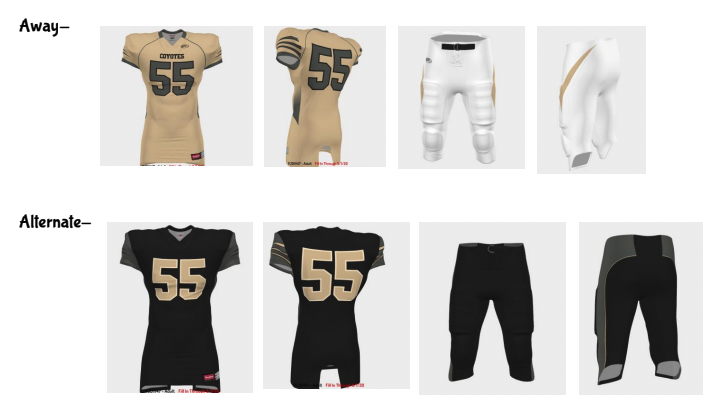
We thought there were some fun game day traditions here, a sound merchandising strategy, and certainly a nice touch to introduce alternate uniforms.
Nice job Coyotes front office!
Elizabethtown High School, PA (Portland Pioneers)
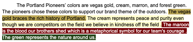
Picking up where they left off, the Pioneers’ front office really crushed it in the second challenge. This certainly seems to be a team making a big jump from year one to year two in this competition. We really loved the concept behind the team’s colorways, and this was the first time we saw a color-coded description of the team’s decisions relating to team colors.
The team logo was much more than just an image, it featured symbolic elements that were expressive of the team’s overall brand identity.
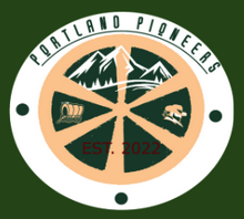
From the Pioneers’ branding report: “The wagon on the left represents the long treacherous travels that pioneers took migrating to the western lands in the 1800s in sights of freedom. The white mountain located in the top of our logo represents a symbol for spiritual peace and freedom. And lastly located on the right side of our logo we have an actual pioneer, his rugged cowboy complexion is a symbol for strength and unity. The wheel also has the team name at the top of it. Also at the bottom is the date that the team was established. The label contains all of The Portland Pioneers colors and is displayed on the helmet.” Good stuff from Elizabethtown students!
Some other highlights include:
- Great slogan with “Pioneer Proud”, immediately ingratiating the team and its brand with the community and local fanbase
- Nice looking uniforms that incorporate all the team’s brand elements
- Awesome mascot with “Chuck the Beaver”
- Lots of great ideas for brand extension, including a Pioneers-branded wagon equipped with t-shirt cannons to launch sponsored / branded merch into the crowd
- One of the most unique licensed merchandise items we have seen in the history of this competition with co-branded camping tents in partnership with team sponsor, Coleman, along with other merchandise with partners like REI, Bass Pro Shop, and Patagonia
The Pioneers’ front office has really established itself as a contender this year. We look forward to seeing how they respond to challenge #3!
Five Star Magnet Academy, FL (Salt Lake City Maniacs)
We loved the alternative uniforms celebrating veterans, really cool idea that will certainly help boost Maniacs’ merchandise sales. FSMA students introduced one of the best distribution strategies we have seen in this competition as well, making it very easy for fans to find and purchase team-branded merchandise, including onsite at the stadium shop, online on the team’s online store, and at retail locations including Dick’s, Bass Pro Shop, malls, outlet malls, and a partnership with McDonald’s that includes Maniacs-branded toys in local Happy Meals.
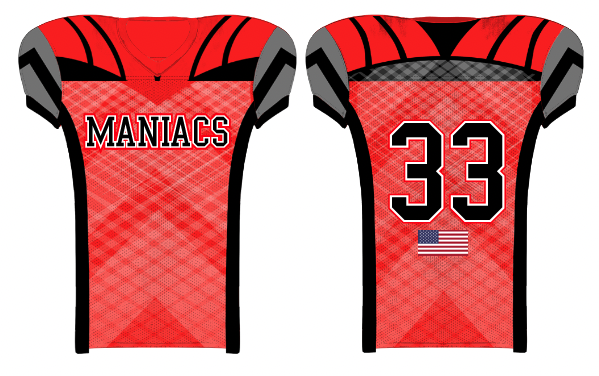
Some good ideas here from students at Five Star Magnet Academy. Nice job Maniacs’ front office!
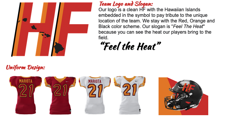
Grant High School, OR (Hawaii Fire)
Grant High School students have really raised the bar in this competition. Not surprisingly, the defending champs and Fire front office response to the branding challenge was, well…fire.
Overall, an excellent description of how all the branding elements come together to determine the team’s colorways: “Red creates and represents a lot of feelings; excitement, passion, energy, and action, all of which our fans will experience when watching the Hawaii Fire. Out of the varying shades of red, we decided on a lighter red, which is similar to the color of lava. This will also pop out when placed on our jerseys and merchandise. We decided on black as a primary color, which is seen as intimidating and blends well with a variety of merchandise to increase sales, along with being a similar color to Hawaii’s many volcanoes. Our next color is orange. Orange pairs well with both red and black and gives contrast while still paying homage to the fiery volcanoes of Hawaii.”
Additional highlights:
- Awesome mascot with “Koa the Rumbling Volcano” who is the focal point of all the franchise community relations efforts, like beach/nature cleanups, in addition to game day duties to inspire the crowd
- Very on-brand game day entertainment with fire dancers, ukulele players, fire breathers etc.
- Local brand ambassadors, beginning with the team’s QB (Hawaii-native Marcus Mariota), Dwayne Johnson and Jason Momoa
- Very unique collection of branded merch items featuring a Hawaii Fire branded surfboard, ocean beaded bracelets w/ proceeds going to charity, swim trunks, bikinis and speedos
- Extending the brand with concessions items at the stadium like hawaiian shaved ice and lava cake
- Interesting idea to host an exhibition event on a US Navy aircraft carrier on Veterans Day, including offense vs. defense beach charity volleyball event
Overall, a fantastic effort from Grant HS students!
Helena High School, MT (Oklahoma Outlaws)
Another fantastic effort from students at Helena High School in this competition…Really loved how the Outlaws’ front office brought together so many aspects of community as part of the branding strategy, including the team name, logo, and colors to represent not just the city but the entire state of Oklahoma:
- “We chose the main colors dark red and blue because the original Oklahoman flag has a dark red background, and the current Oklahoma flag is a blue background with a mostly tan crest. Also, many people refer to the soil in Oklahoma as red dirt, which is one of the reasons we utilized red in our color choices. We will also include accents of tan/orange, which tie into the large tan wheat fields throughout the state, as well as in the state crest. Oklahoma is the nation’s fourth largest wheat exporter and agriculture is an extremely important part of Oklahoma’s culture, heritage, and history. The logo includes these colors as well, as a homage to the people of Oklahoma. The primary logo is an outlaw with a hat with Oklahoma Outlaws in the outside of the outlaw. Note the state of Oklahoma on the hat! The secondary logo is the outlaw only. We wanted to make sure that our brand fully represents Oklahoma and its people. The logo gives a nod to the wild west days that Oklahoma was once a part of. Cowboys, ranching, and outlaws have been part of Oklahoma’s history for more than a century and we wanted to make that was incorporated in our design.”
We LOVED the clever slogan, “Ropin’ in the Win”, totally on-brand and a great way to build excitement for the season. Another thing that really stood out with the Outlaws’ branding report was prioritizing brand image and developing a brand that represents family values. This is a really smart strategy and will allow for all future marketing initiatives to be more targeted, effective, and efficient. We also appreciated seeing the attention to licensing, and the understanding of how the franchise will benefit from a sound licensing strategy as it looks to maximize merchandise sales.
Overall, really nice work from Helena High students!
Kent Career Technical Center, MI (Berlin Badgers)
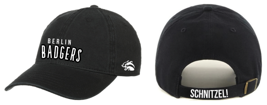
Smart strategy to dial up a branding strategy that would incorporate as many elements as possible to connect with fans throughout Germany, and designing a logo that ties in with the German flag seems like a great way to go.
Also, the Badgers mascot, “Schnitzel”, might be the best we’ve seen in this competition. Loved the idea of incorporating the mascot with some of the merchandise items, including a Badger-themed mask.
Nice job Badgers’ front office!
Woodbridge High School, VA (San Antonio Spiders)
Some really creative branding from Woodbridge High School students in this challenge…
Highlights include:
- A “Whataburger X Spiders” co-branded reusable cup that offers free soda refills at home games all season long, along with another co-branded promo with sponsor Pizza Hut offering a Spiders-themed signature pizza available on game days with 8 slices, the same number of legs as a spider, for $8.88
- Great family branding with “Toni the Spider” mascot
- Love the idea of promoting the “top 5 most popular Spiders merch collection” to create demand for branded merch
- Weaving sustainability in with the franchise branding to help position the team favorably within the community and sports fans as a whole, great idea to follow the lead of the Dolphins with a goal of becoming the 2nd NFL franchise (and the first in Texas) to completely eliminate the use of plastic products at the stadium
- Leveraging Halloween as an opportunity to build the brand with spiders being used in so much of the holiday’s imagery, along with the game day tradition of using streamers to create a web in the crowd every time the team scores…unique traditions like that can certainly help to build brand loyalty with your fan base!
A job well done by the Spiders’ front office!
SCC FFL 2022 STANDINGS AFTER CHALLENGE #2
| School | Team Name | Total Points |
| Grant High School | Honolulu Fire | 497 |
| Helena High School | Oklahoma Outlaws | 497 |
| Elizabethtown High School | Portland Pioneers | 496 |
| Blacksburg High School | Virginia Beach Tridents | 495 |
| Woodbridge High School | San Antonio Spiders | 493 |
| Montgomery County | Salt Lake City Scorpions | 492 |
| Kent CTC | Berlin Badgers | 490 |
| Carl Sandburg High School | Toronto Coyotes | 490 |
| Five Star Magnet Academy | Salt Lake City Maniacs | 488 |
| Tolland High School | San Antonio Spartans | 487 |
| Los Banos | Santa Cruz Prairie Dogs | 487 |
| Northwest HS | Salt Lake City Mountaineers | 486 |
| Wichita East | Kansas Knights | 485 |
| Kellam High School | Toronto Taipans | 485 |
| Kent ISD | Portland Wildcats | 483 |
| Bigfork High School | Salt Lake Pronghorns | 482 |
| Richardson High School | Portland Lumberjacks | 480 |
| Miami Valley MVCTC | Dayton Jokers | 248 |
| Heritage HS | Augusta Elks | 244 |
| West Forsyth | 0 | |
| Roslyn High School | 0 | |
| Brighton | 0 |