SCC FFL 2023: Sports Marketing Challenge #2 Recap & Scores
SCC FFL 2023: Sports Marketing Challenge #2 Recap & Scores
After two challenges, the leaderboard remains crowded at the top. As expected, there is a very competitive field this year, and everyone is still in the mix for a run toward the top of the standings.
The second challenge in this competition requires students to demonstrate a fundamental understanding of branding and licensing. This is one of our favorite challenges as we start to see some of the creativity from students really stand out. The logos, merchandise ideas, mascots, slogans, and other aspects of brand development for the expansion franchises are always on point, and this year’s submissions did not disappoint.
Points have been allocated for challenge #2, and the updated standings are available at the bottom of this post. Every team offered some fantastic ideas for branding. Where most fell short was a lack of attention to addressing the licensing process and the importance of licensing.
While everyone submitted a fantastic response to challenge #2, we wanted to highlight a few standout branding ideas in this post. We look forward to seeing what students come up with in the next round!
Blacksburg High School, Virginia (Austin Diablos)

Blacksburg students impressed once again with a fantastic response to the branding challenge. The Diablos nailed every aspect of this challenge, and are in contention for a championship yet again this season, as they almost always seem to be.
One thing that always helps a team to score well is an attention to detail in the way they support the decisions made for each challenge. The Diablos front office did just that, building a brand with strong ties to community and, most importantly, in step with the team’s initial goals and objectives outlined in the marketing plan from the first challenge. Consider the team’s explanation for franchise colorways: “Our team colors support our intimidating yet inclusive brand. Red is a strong color. Additionally, red resembles the intimidation that the Diablos bring on the field. However, off the field, the Diablos bring inclusivity and solidarity. To represent this, we included black as one of our two main colors. As an accent, we used the color sand to resemble the ground that we stand on as a community. We have chosen the slogan “Bring the Heat” to further the intimidation factor.”
We also really liked some of the ideas for building the brand on game days with activities such as:
- During the night game we give out wristbands that glow fire (emulating the stands lit on fire).
- During day time games we wave black and red flags during our intro and whenever we score.
- To increase reach and brand engagement, fans will be able to visit our mascots (four horses) at Lone Star Ranch, Tri-Star Farm, and Kristull Ranch.
- We provide red cowbells, nicknamed “Hell’s Bells,” and prompt fans to ring them for each big
play - Diablo hot sauce contest in the concourse on game days
Another highlight from the Diablos’ report was the detail that went into establishing price points for the team’s merchandise offerings. Blacksburg students identified the cost associated with each item before assigning a price, recognizing the importance of margins when establishing prices. The Diablos’ front office absolutely smashed it with this challenge response.

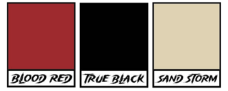
Wichita East High School, Kansas (Kansas Tornadoes)
Wichita East, one of just a few schools who have participated in this competition every year, put together one of the best responses to the branding challenge in school history. We were thrilled to see such a fantastic branding strategy from Brandon Reith’s students.
One thing that really stood out was the team’s decision on brand colors: “The gold color represents the wheat that resonates through the state of Kansas in the summertime. The grey/black color represents the sky when a tornado is about to appear.” We also enjoyed the teams hashtag (#TornadoWarning) for the season on social media.

We also really liked the team’s mascot. Interesting choice to choose a buffalo rather than something with tornado-imagery, but as the Kansas state animal, it works. Wichita East students clearly did their homework, researching other teams and their mascots and taking a cue from Minor League baseball teams who feature mascots in the likeness of something other than the team’s nickname. To bring things fool circle, the Tornadoes front office opted for “Twister” as the mascot’s name. The franchise cheer team will be known as The Windstorm, named because it’s a synonym of tornadoes.
As icing on the cake, the Kansas front office will offer some really creative and unique branded merchandise items to fans, including Weather Radios, Tornadoes-branded Board Games, Tornado Emergency Kits, and Action figures including “Twister”, the team’s mascot.
Fantastic job Wichita East students!
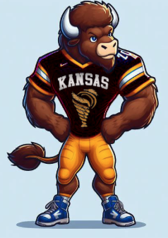
Jefferson Forest, Virginia (Toronto Huskies)
You wouldn’t guess that Jefferson Forest High School is a newcomer to this competition thus far, as they have submitted two really impressive responses to sports marketing challenges #1 and #2. Where the Huskies front office really thrived was a focus on protecting the brand by applying for several trademarks to use for selling licensed merchandise, incluidng “Toronto Huskies”, and “Pack to Pack.”
We also really liked team’s logo which incorporated the image of a maple leaf, often a staple in Canada-themed brand initiatives.
Overall, a really nice effort fom the Huskies front office.
Five Star Magnet Academy, Florida (Utah Allos)
Another “rookie” classroom in this competition making some noise so far, it was great to see the attention to detail that went into the development of the Allos brand from FSMA students, right down to the colorways used to create the team’s colors. According to the Allos’ branding report: “Our choice of colors reflects the essence of Utah’s natural beauty and its resilient spirit. Dark green signifies the lush forests, national parks, and scenic landscapes that make Utah unique. It represents the strength, resilience, and determination of Utah’s people. It symbolizes the hardworking spirit and dedication of the community. The red and gold accents add vibrancy and energy to our branding, mirroring the passionate culture and nature of Utah residents.”
We also really loved the team’s mascot and slogan for the team’s inaugural season. The slogan, “Utah Allos: Unleashing Prehistoric Might,” represents the team’s unique identity and purpose and pays tribute to the region’s natural history with an Allosaurus mascot, demonstrating a commitment to blending the might of prehistoric heritage with contemporary sports excellence.
Really nice start for the Allos front office, we look forward to seeing them build on their early success!
Miami Valley Career Tech Center, Ohio (Gem City Warhawks)
No surprise given the track record from Zach Gueth’s students in this competition, we saw some really fun branding from MVTC HS students for this challenge. Highlights include:
- “Fly to the Top” as the team’s inaugural season slogan, a nod to the area’s rich aviation history and in line with the team’s nickname, the Warhawks (a World War II warplane on display at the Dayton Air Force Museum near the team’s headquarters)
- Four different uniform combos, including home, away, alternate, and color rush
- Introduction of a rewards program to build brand loyalty in the team’s inaugural season
- Plenty of on-brand game day experiences, featuring photo ops with the team mascot and in one of two real Warhawk planes at the stadium, a halftime kids race in “drivable” planes, and charging stations onsite at the stadium
Nice job Warhawks front office!
Grant High School, Oregon (Mexico City Vipers)
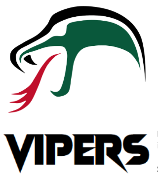
Grant High School delivered another solid response to the branding challenge, as the Mexico City Vipers front office clearly invested a lot of time and energy in the creation of a brand for the franchise’s inaugurual season.
One thing we really liked was the collab with Nike to launch Vipers-branded Air Force 1’s as a limited edition merchandise offer.

Also, we always see a few new things every year in this competition, and Grant students delivered another first with the introduction of a “mood board” to provide some insight to the inspiration behind the branding strategy.

Really well done.
Elizabethtown High School, PA (Miles City Jedis)
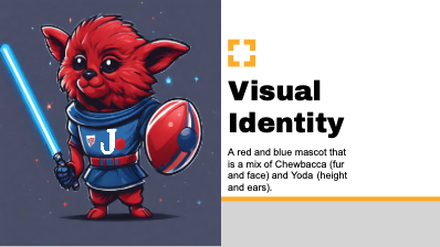
Without a shadow of doubt, Justin Ivans’ students at Elizabethtown High School in Pennsylvania gave us the most unique city (Miles City, MT) AND the most unique team nickname (Jedis) that we have ever seen in this competition. We are anxious to see how they develop a marketing strategy around those decisions, and if the branding is any indication, the Jedis front office are poised to make a potential run at a championship this year.
We loved the slogan, “Unite the Galaxy, Embrace the Force!” and appreciate how students tied this to the mission statement from the first challenge with a focus on inclusivity, and building a slogan around that theme. We also really liked the logo, and co-branded concessions offerings with Grubhub, including a unique Jedis-branded meal kit service, called Galactic Grub.
Fantastic job Elizabethtown students!
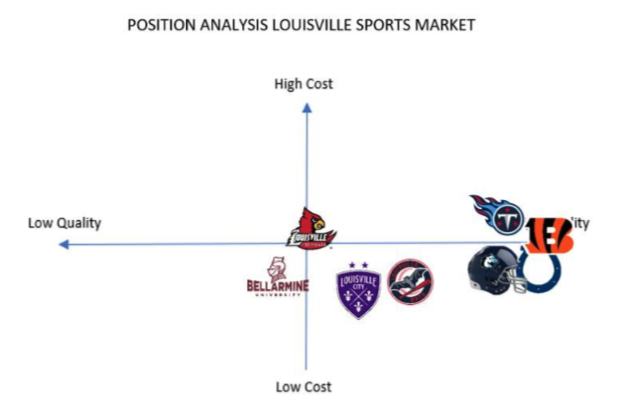
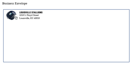
Waverly High School, New York (Louisville Stallions)
The most comprehensive branding and licensing plan from this challenge, Waverly students have come racing out of the gate in this year’s challenge. By addressing the Stallions’ strategy for developing brand purpose, brand values, brand personality, a positioning strategy, and brand identity, they demonstrated a really advanced level of understanding of the branding concept.
We loved seeing the group use a positioning map to illustrate the brand and positioning concept relative to other competing franchises in the market as well, another next level addition to the Stallions’ branding plan.
Waverly students also showed how the brand would be used, including samples of team notepads, letterhead, staff badges, business cards and more. That’s the type of attention to detail that wins that helps separate teams in this competition.
The plan as a whole was super impressive, including tons of merchandise options while including an inventory management strategy to boot. The Stallions’ front office has been really next level so far in this year’s SCC FFL. Can they keep it up? We are anxious to find out!
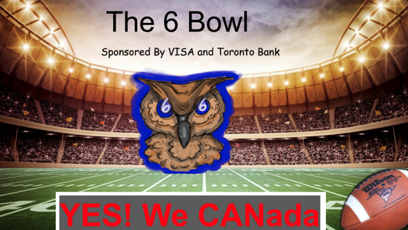
Green Run High School, VA (Toronto Owls)
As teams in this competition typically gravitate to the “fun” aspects of a challenge like logo development, mascot decisions, and creating a slogan, finding ways to demonstrate a clear understanding of the core concepts that define each challenge sometimes become an afterthought. Green Run students, however, never seem to miss a step, making sure to carefully address each requirement from each challenge. The Owls’ response to challenge #2 was no exception, and this group did a fantastic job recognizing the importance of licensing, and detailing each step of the licensing process, and why that is important to the merchandising efforts of a professional sports franchise.
Green Run students also showed that they are plugged in to industry trends, tapping into the NFL’s recent “Toy Story” game broadcast and jumping on that trend, creating collabs with Drake’s OVO, Crocs, and even LEGO for Owls-themed stadium sets and characters in the likeness of Owls’ star players.
We also really liked the logo strategy, along with the incorporation of a “hiddent” logo: “The Toronto Owls logo is wise and strong. The owl is like our football team: calm, cool under pressure, but ready to strike with razor sharp talons when the opportunity arises. Hidden within the logo is the number 6 which is a lucky number for Toronto and represents the various areas that feed into the city’s life.”
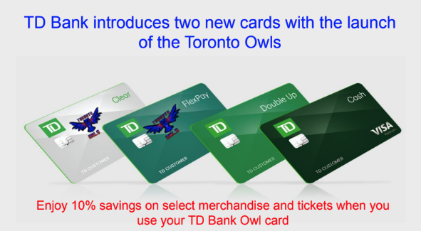
From co-branding (like this credit card with sponsor TD Bank), creative brand extensions, cross promotions, and game day traditions, the Owls’ front office nailed this challenge. Fantastic effort!
SCC FFL 2023 STANDINGS AFTER CHALLENGE #2